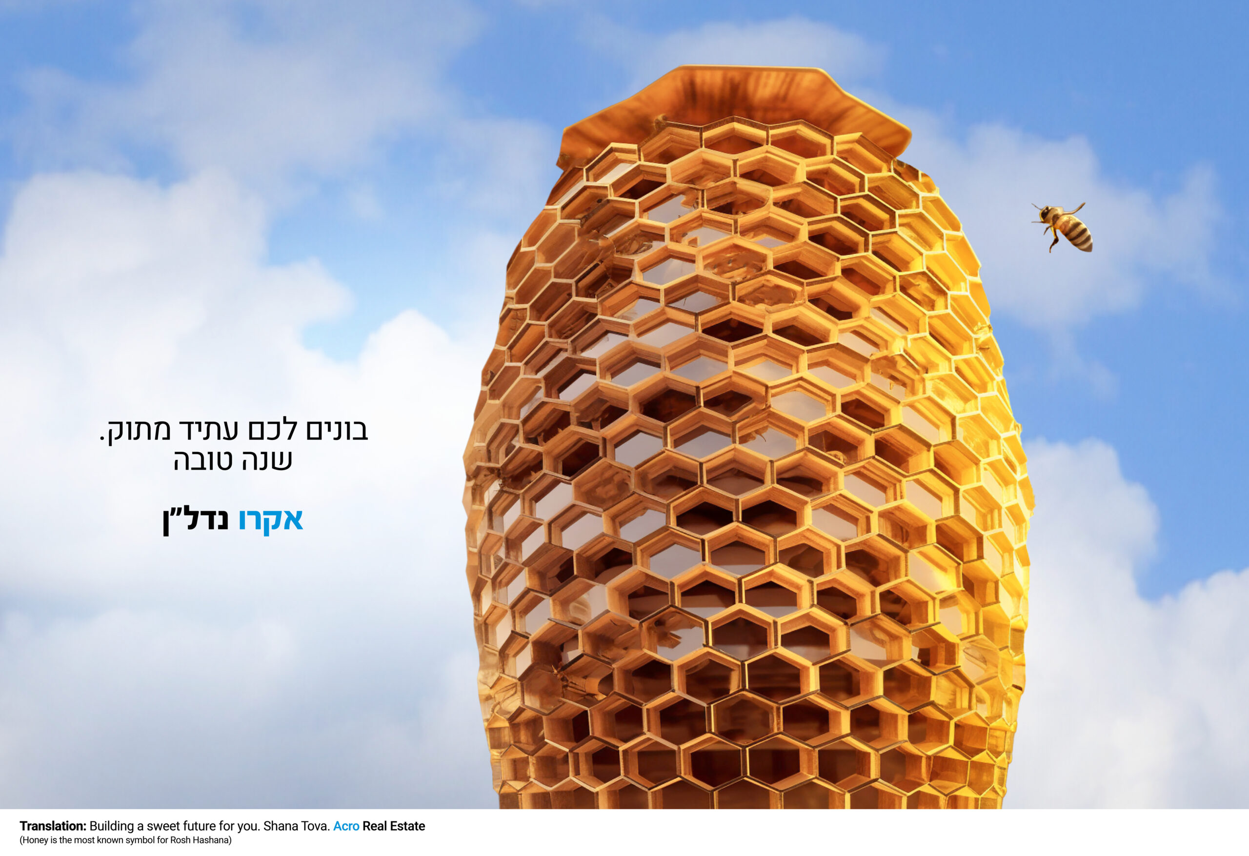
Acro is an Israeli Real Estate company and the Jewish New Year “Rosh Hashanah” is celebrated in September.
Honey is the most known symbol for Rosh Hashanah for wishing “Shana Tova and Metuca”, which means Happy and Sweet Year. Acro looked for a way to not only wish a sweet and happy year, but also to ENHANCE their refined architectural style. And what a better way to do it, than with the perfect natural shape of a honeycomb.
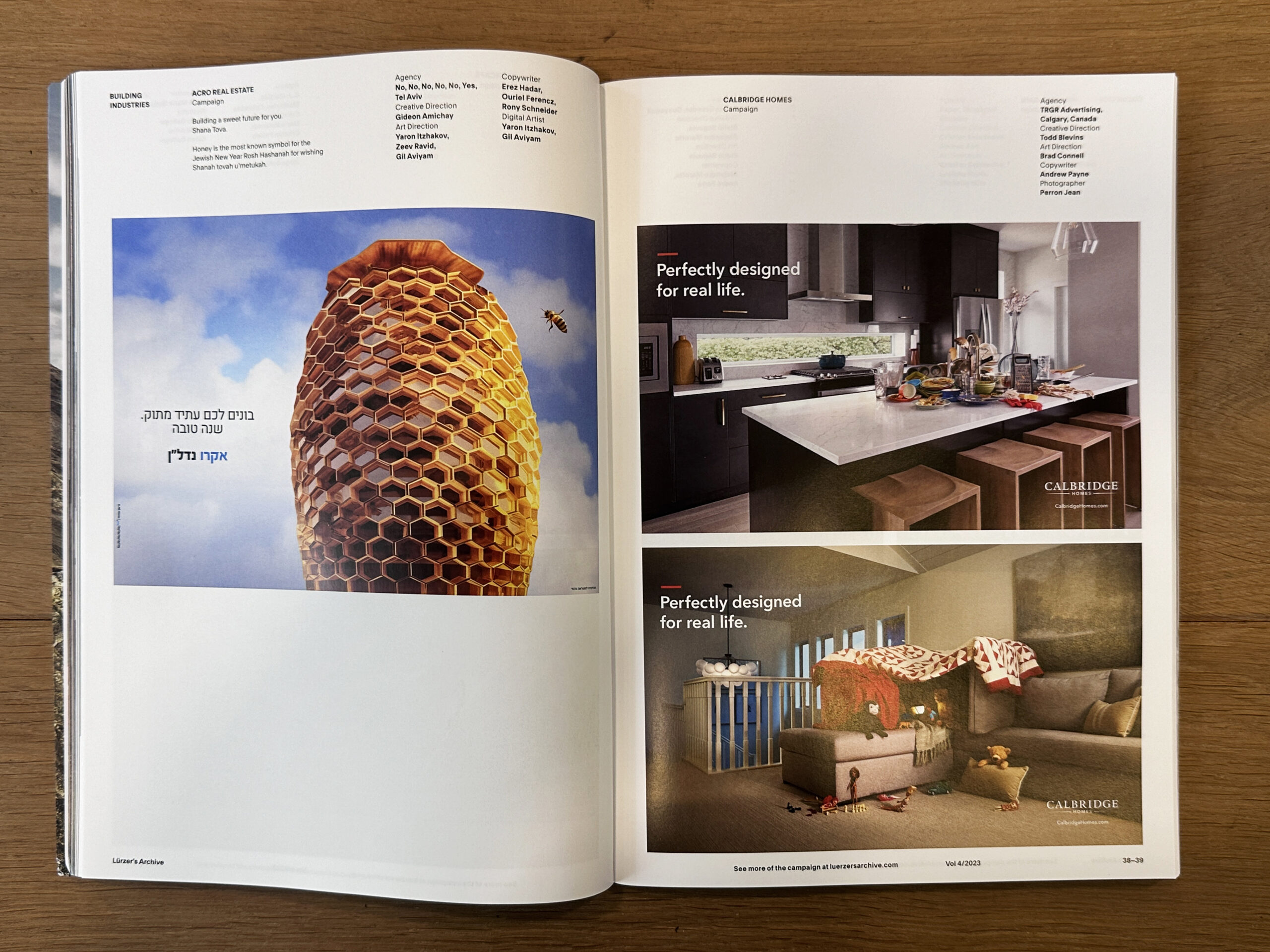
Selected and published on Lurzer’s Archive 4/23
Posted inInnovation|Comments Off on “Shana Tova and Metuca”
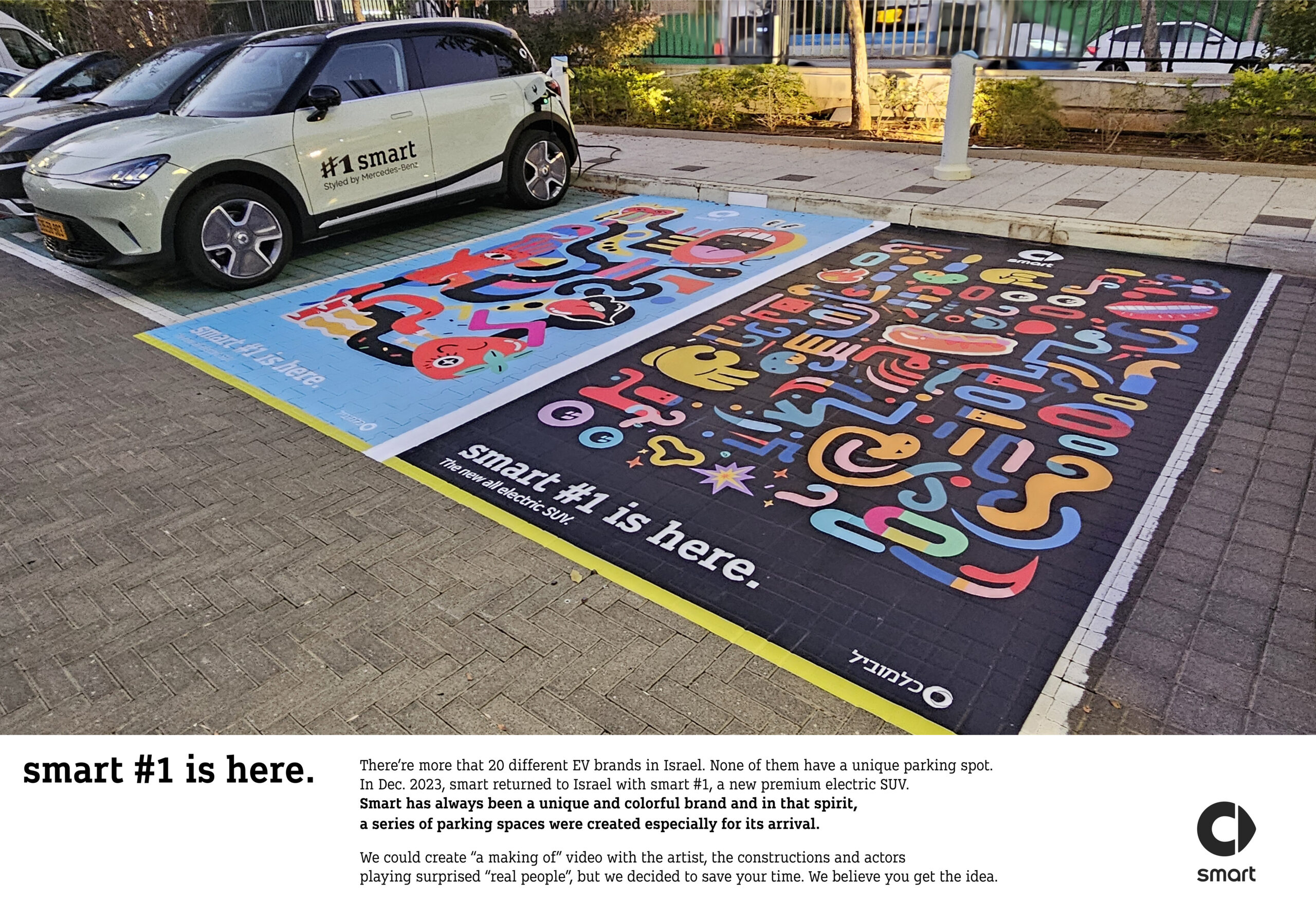
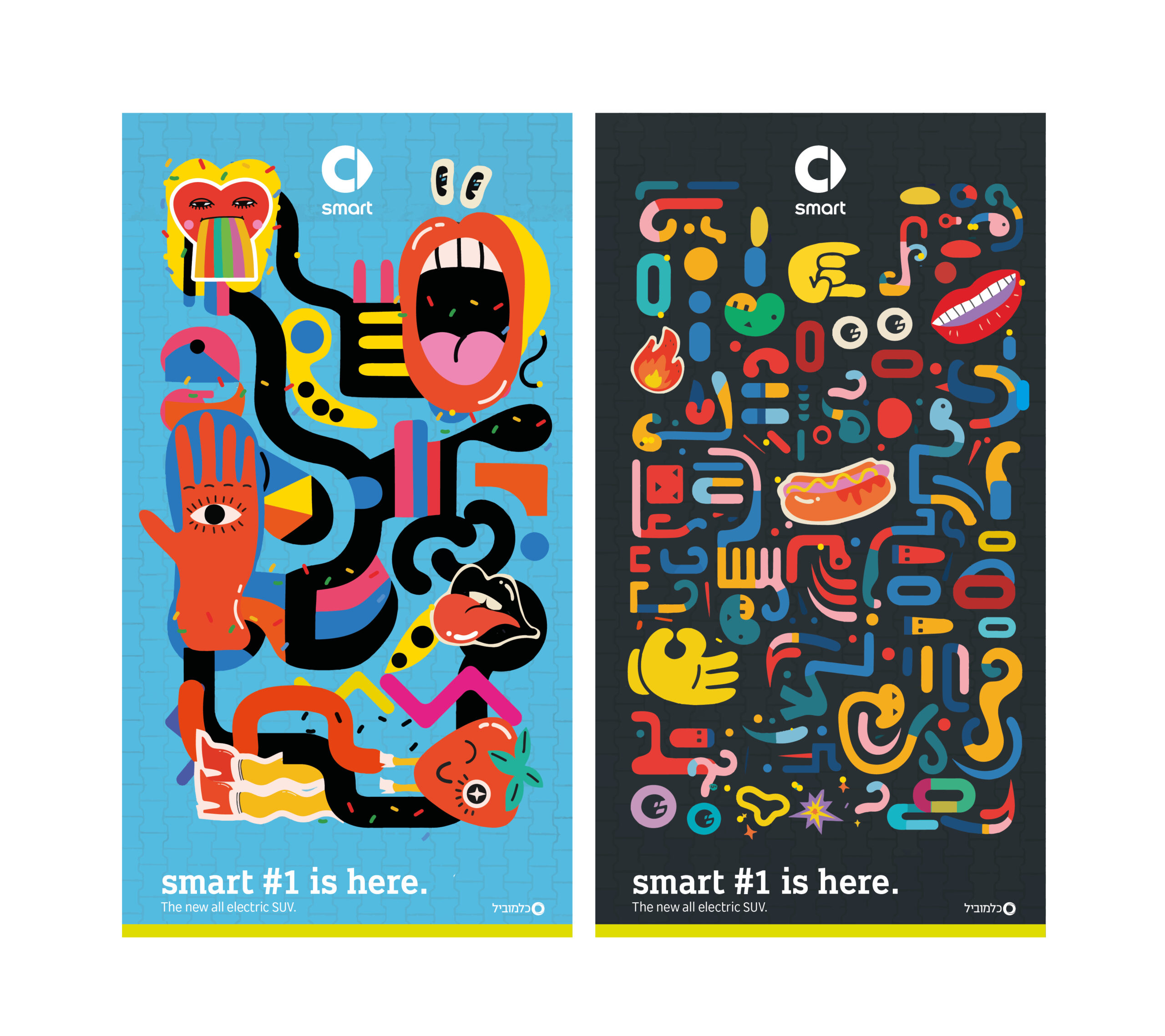
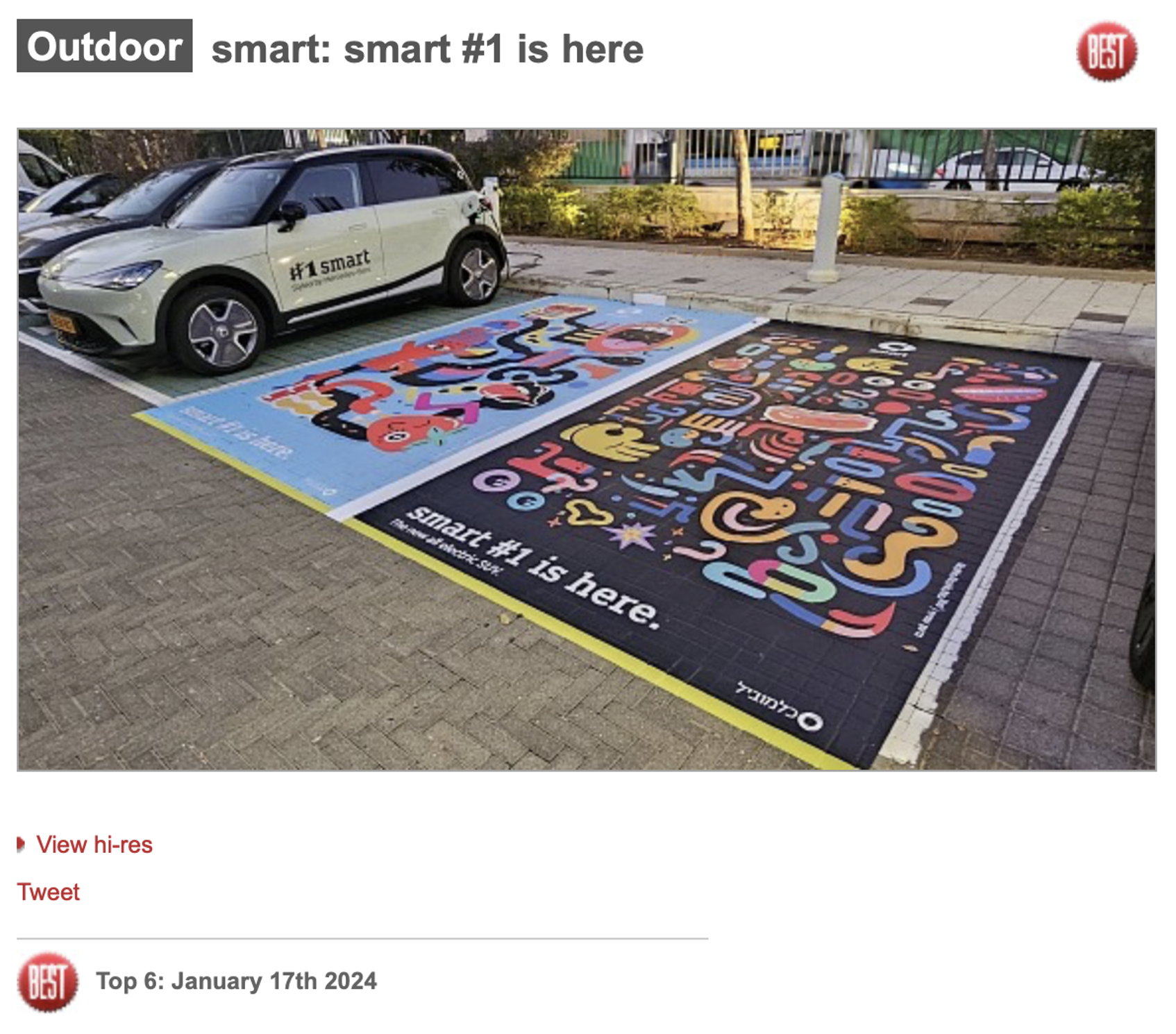
There’re more that 20 different EV brands in Israel. None of them have a unique parking spot.
In Dec. 2023, smart came back to Israel with smart #1, a new premium electric SUV.
smart is not another brand. Never has been. In the spirit of smart, a series of parking spaces were created especially for its arrival. We could create “a making of” video with the artist, the constructions and actors playing surprised / amazed people, but we decided to save your time. We believe you get the idea.
Artist proof
BEST OUTDOOR Top 6, January 2024
Posted inInnovation|Comments Off on smart #1 is here
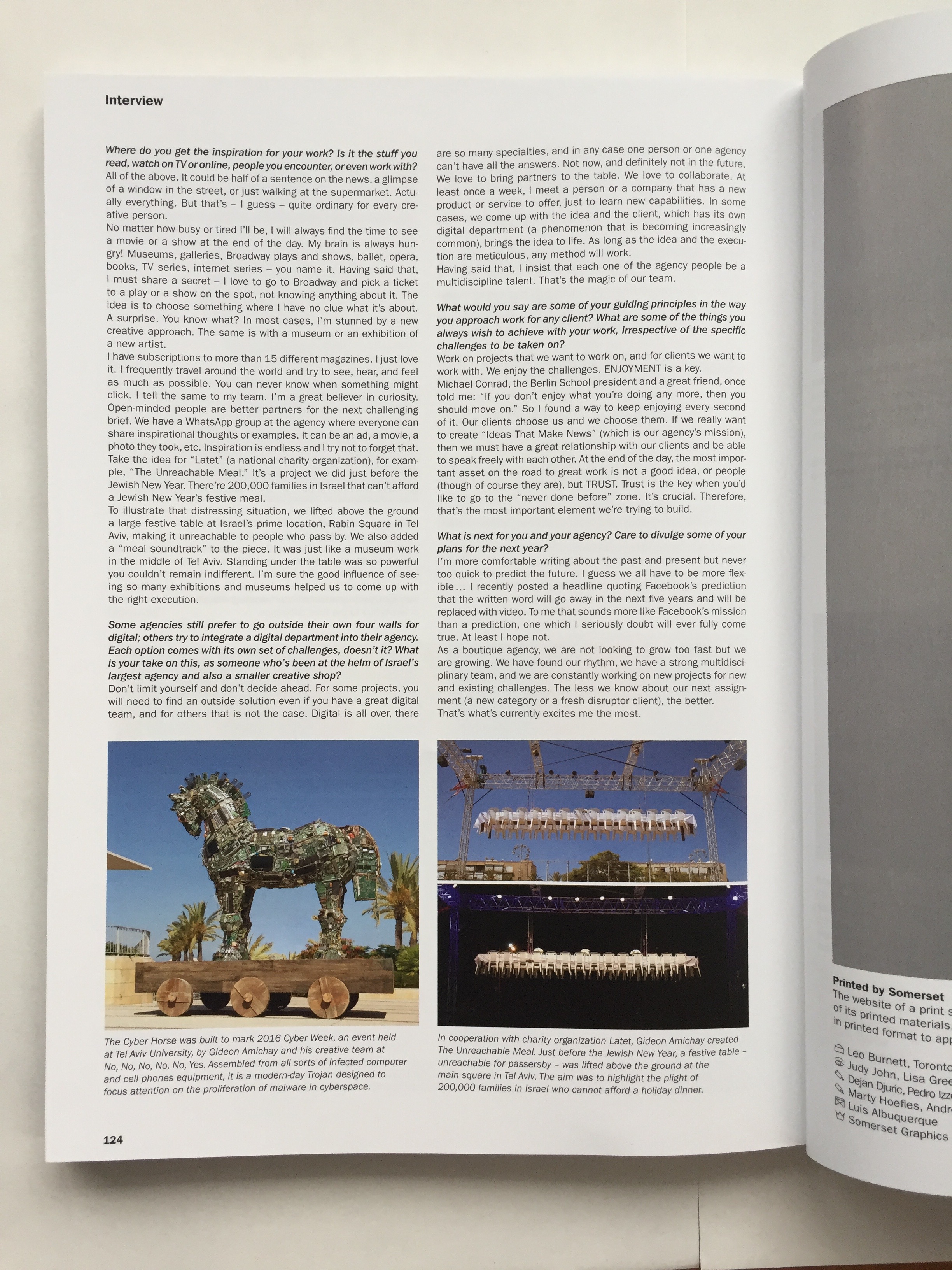
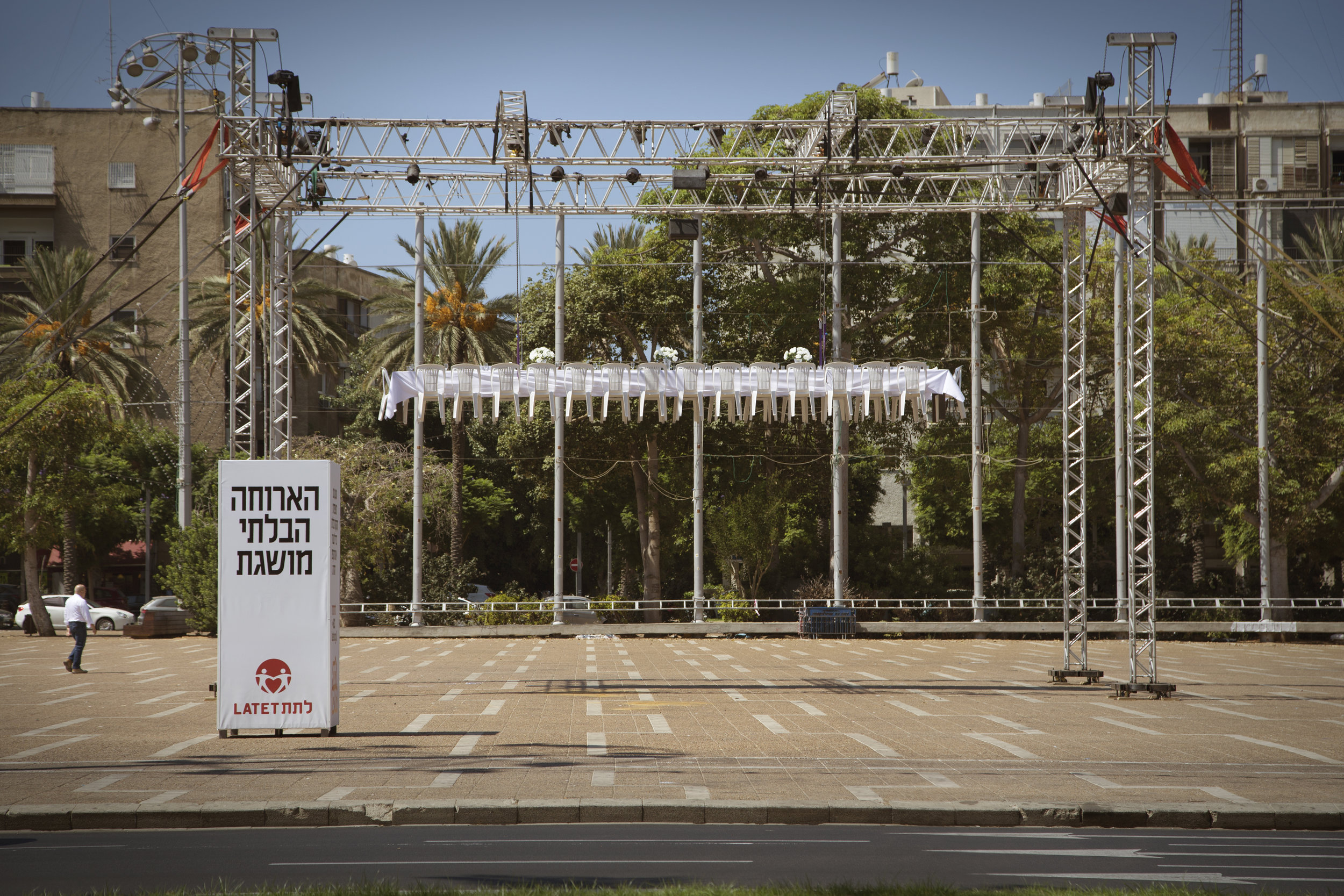
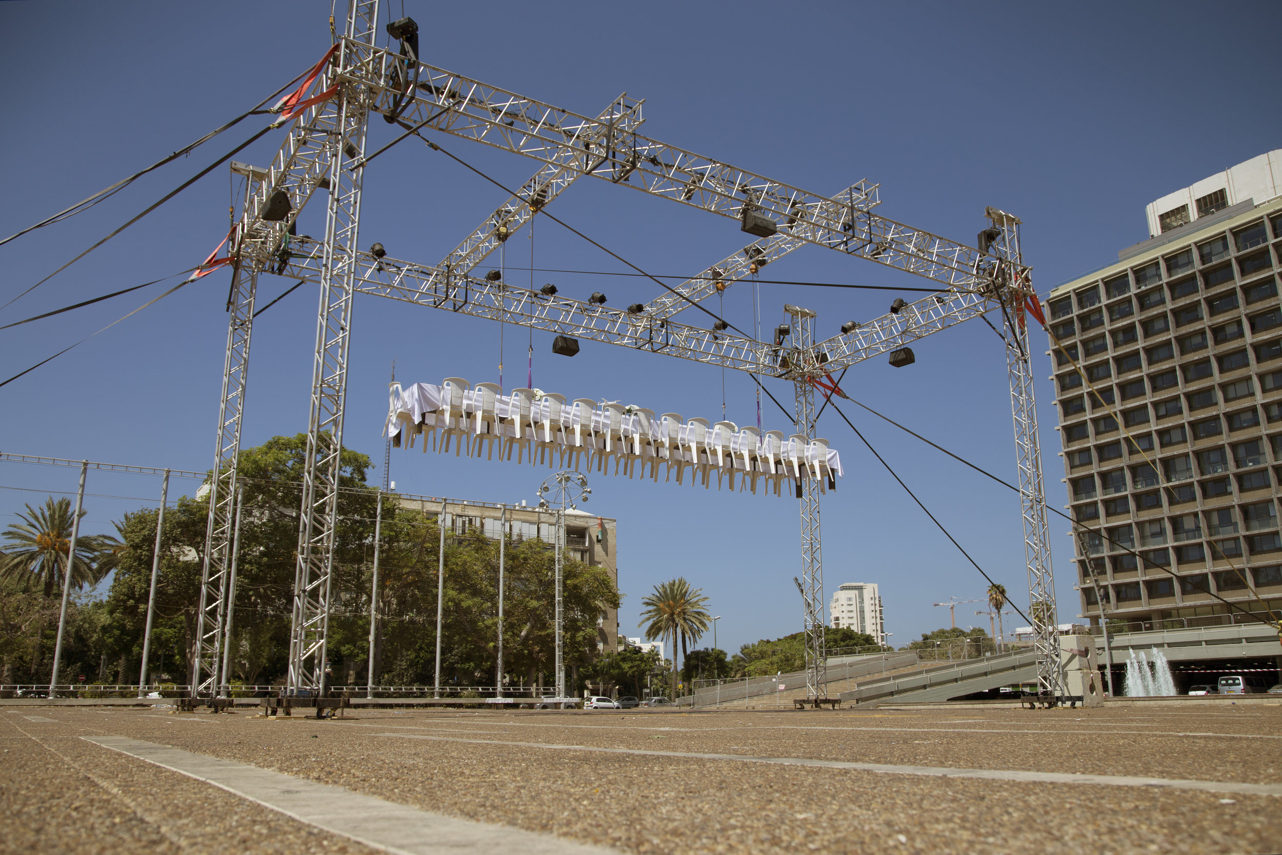
200,000 Families in Israel can’t reach a Jewish New Year’s festive meal.
To illustarte that distressing situation, LATET – a national charity organization lifted above the ground a large festive table at Israel’s prime location:Rabin Square in Tel Aviv, making it unreachable to people who pass by.
Idea & deasign : Gideon Amichay, Rony Scheinider, Gil Aviyam, Liron Ben Yacov, Zeev Ravid, Daphna Tsror, Tamar Heilweil, Liat Lapushin, Gali Snir Namdar, Moshe Benisti Photography: Chen Mika. Construction and Execution: Yaakov Turgeman, Meir Guri, Gadi Maimon (Jack Robinson). Lightning: Gil Teichman. Sound: Soundhaous. Production: LATET
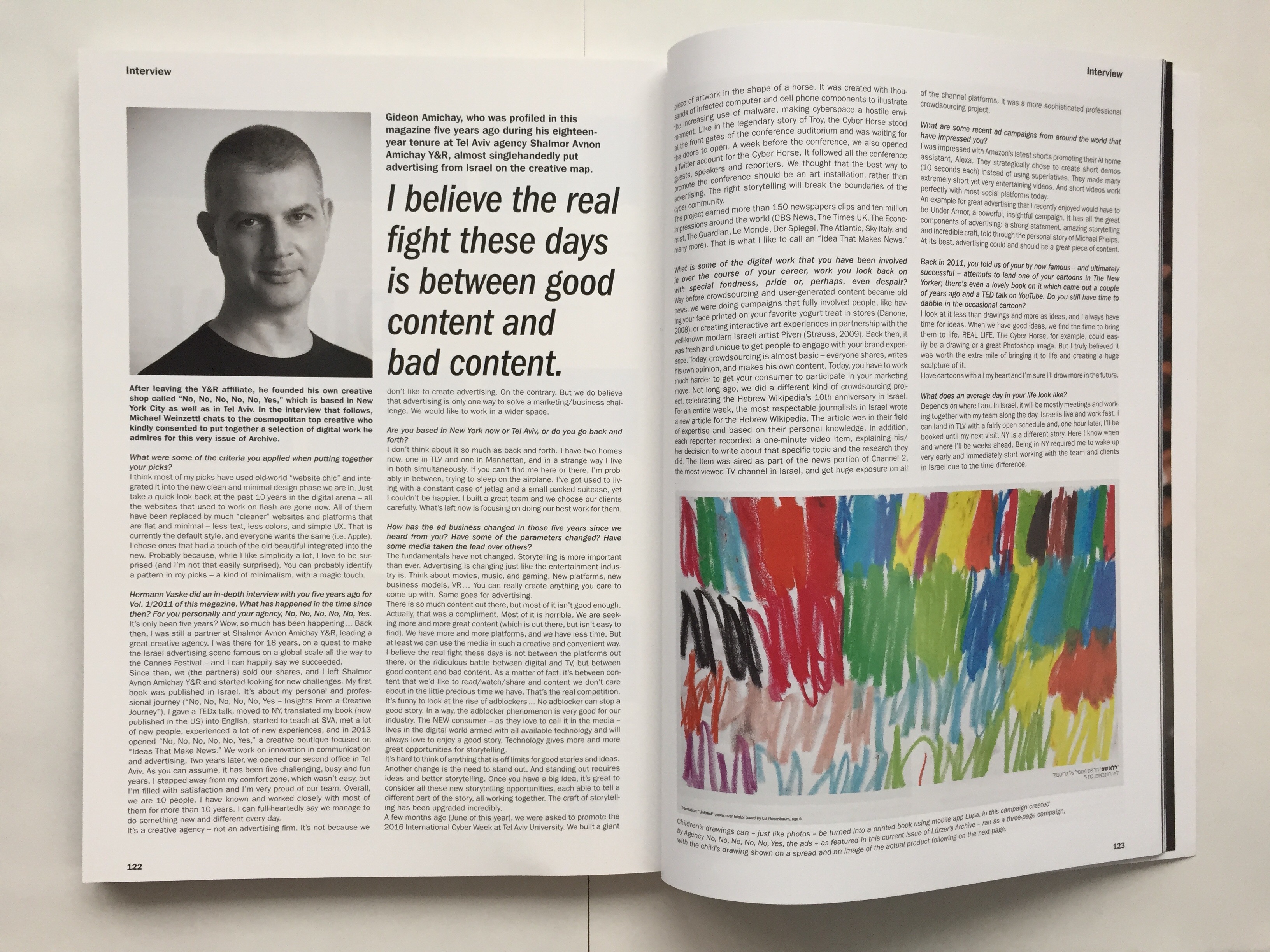
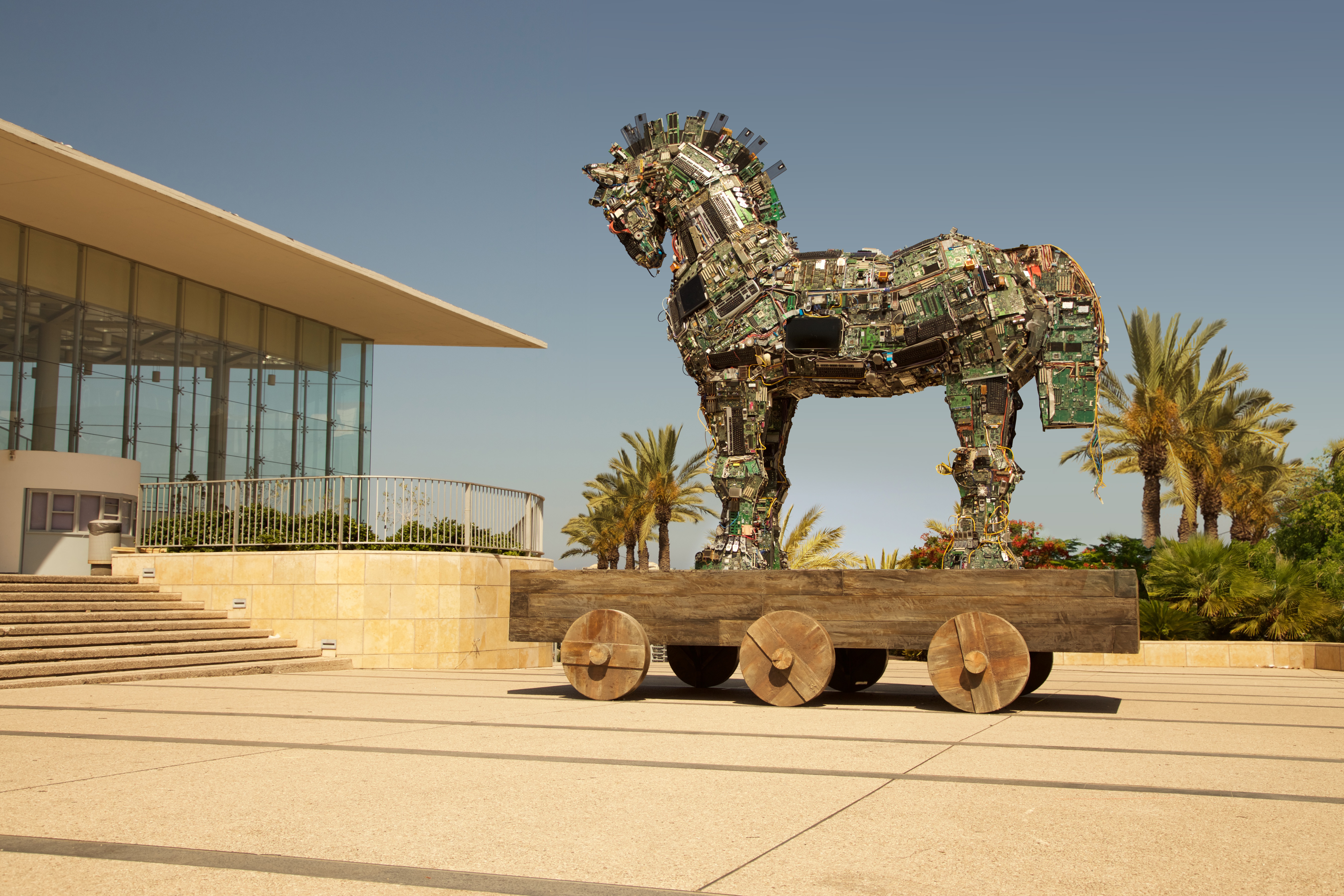
The Cyber Horse is a piece of work created with thousands of infected computer and cell phone components. It illustrates the increasing use of malware in making cyberspace a hostile environment. Like in the legendary story of Troy, the Cyber Horse stands at the front gates of the Tel-Aviv cyber conference auditorium. Like its namesake, it conceals bad news and is waiting for the doors to open. The Cyber Horse was built as a tribute to the 2016 Cyber Week in Tel-Aviv University
Idea, design, & installation: No, No, No, No, No, Yes – Gideon Amichay, Rony Schneider, Liron Ben-Yacov, Gil Aviyam, Zeev Ravid, Daphna Tsror, Tamar Heilweil, Liat Lapushin, Gali Snir Namdar, Moshe Benisti, Yaakov Turgeman, Gadi Maimon
Posted inInnovation|Comments Off on CYBER HORSE 2016
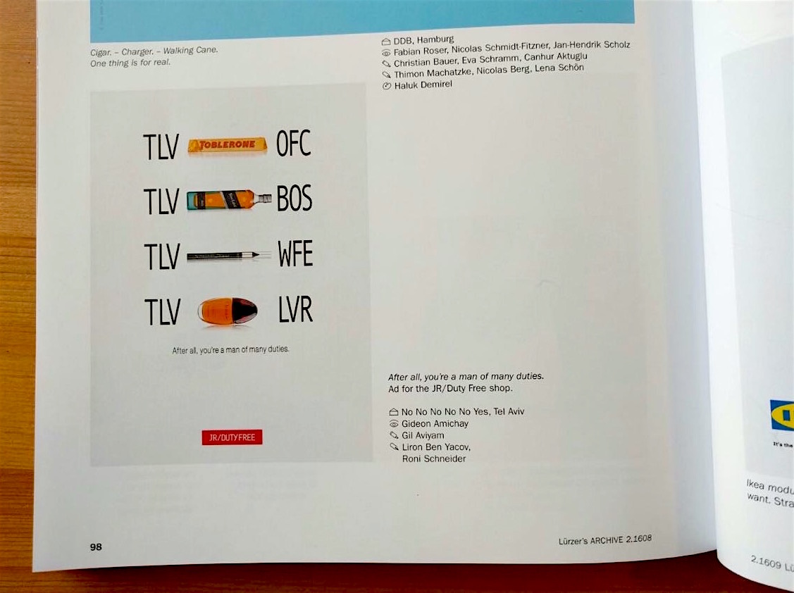
Agency: No, No, No, No, No, Yes
Chief Creative Officer: Gideon Amichay, Creative team: Roni Schneider, Gil Aviyam, Liron Bey Yacov, Account Supervisor: Daphna Tsror, Designers: Liat Lapushin, Gali Namdar
Posted inInnovation|Comments Off on Lurzer’s ARCHIVE 2/2016